Customers don't think in payment rails. So we stopped making them.
As a Senior UX Designer at JPMorgan Chase, I shaped blue-sky product direction for wires, transfers, and P2P payments, with flows built on smart search, recents, and contextual prompts that catch expensive mistakes before they happen.
The problem
"Send money" at a bank is really five products wearing one trench coat: Zelle, internal transfers, ACH, wires, and bill pay, each with its own entry point, vocabulary, and form. Customers were forced to answer a question they shouldn't have to: which rail do I want? Pick wrong and the money is slow, costs a fee, or, in the worst wire-fraud cases, unrecoverable.
Usability research kept surfacing the same two failure modes: people couldn't find the right way to pay, and people made high-stakes data-entry errors that no screen caught until it was too late.
The direction
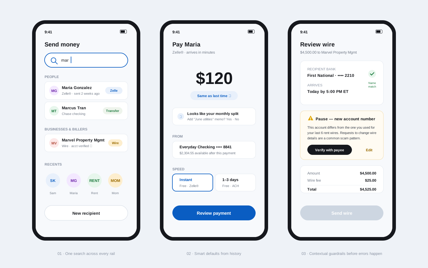
The blue-sky flows I designed argued for three shifts, each demonstrated end to end:
- One front door, every rail. A single smart search across people, businesses, and billers. Type a name; the system resolves the relationship and recommends the rail (Zelle, transfer, or wire) instead of asking the customer to know it.
- Memory as an interface. Recents and learned patterns do the heavy lifting: last amount, usual account, detected monthly rhythms, each offered as a one-tap default, never an assumption.
- Guardrails at the moment of risk. Contextual prompts triggered by anomaly, not policy: a changed account number on a recurring wire payee reads as a scam signal and pauses the flow with a concrete next step, verify with the payee, rather than a generic "are you sure?"
How blue-sky work earned its keep
Vision flows are cheap to ignore unless they're concrete. These were built as full, clickable end-to-end journeys with real edge cases (wrong-account wires, first-time payees, split rhythms) and used in research and roadmap planning. Individual patterns (smart search, recents-first entry, anomaly-triggered prompts) were then pulled forward by product teams into shipping flows, where the error-prevention patterns measurably reduced payment mistakes.
Outcome
These mockups are recreations made for this portfolio. Data, copy, and visual details have been altered to honor confidentiality; the interaction patterns are representative of the design direction.